

In this article (7)
Guidelines exist for people who were not in the room
The printer who has your logo and no context. The freelancer building a deck on a Friday. The new marketing hire in month two. Brand guidelines are written for them, not for the people who commissioned the identity and already know how it works. That single test settles most arguments about what belongs in the document: if it does not help a stranger apply the brand correctly without calling you, it is decoration.
Logo, colour, type and real applications
A short section on what the brand is for and who it speaks to, so choices have a reason. The logo with its clear space, minimum size, approved variants and the backgrounds each one is allowed on. Colour specified in HEX, RGB and CMYK, because a printer cannot use a screen value. Typefaces with weights, sizes and line spacing, plus a named fallback for the day someone has no licence. And enough real applications that a reader can pattern-match rather than interpret.
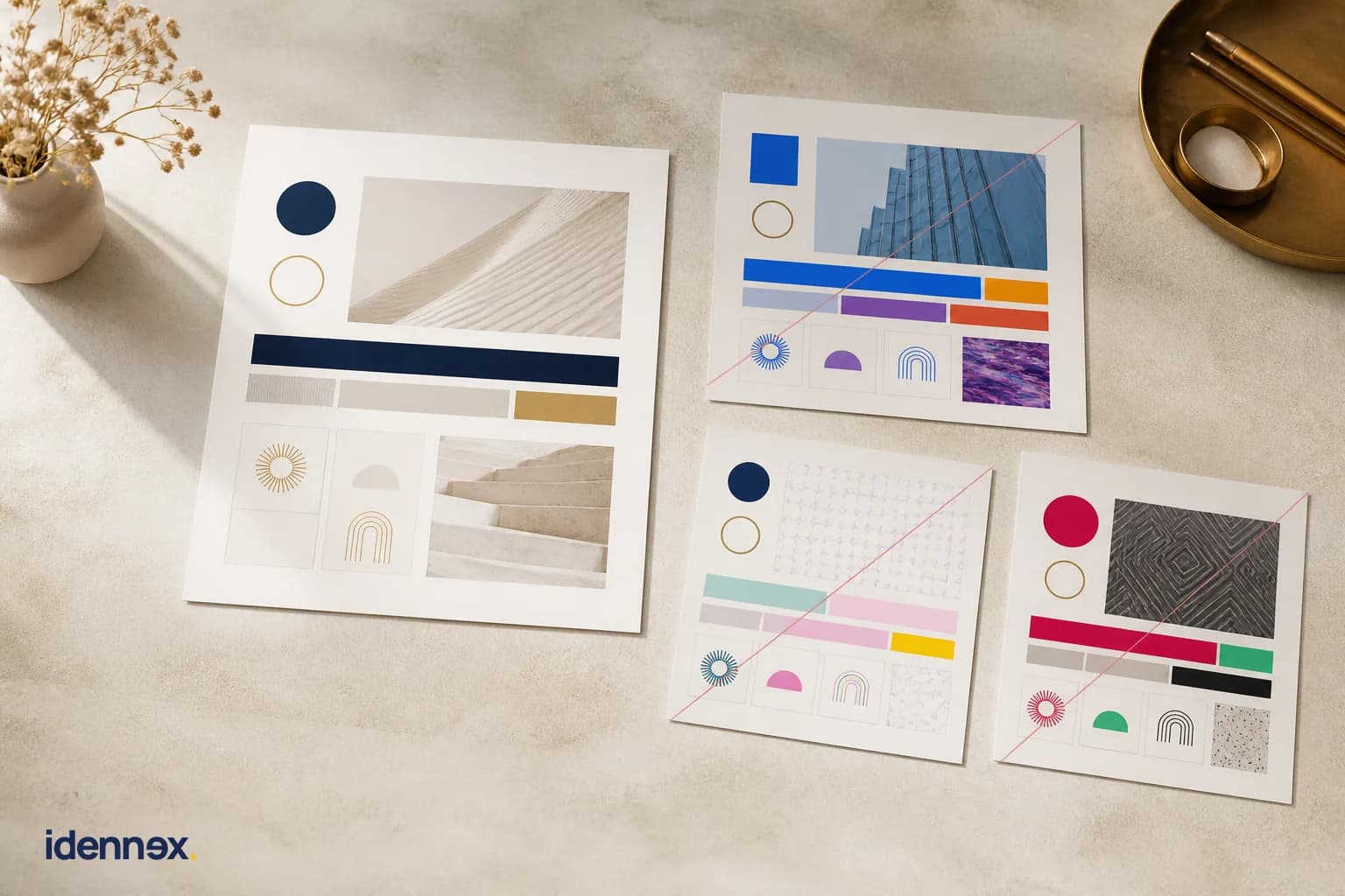
Show the wrong version too
The most-used pages in any decent brand book are the ones showing what not to do. Stretched logo, wrong colour, drop shadow, mark on a busy photograph, three typefaces on one slide. People learn faster from a marked-up mistake than from a rule written in the abstract, and it settles disagreements without a meeting. If you have seen the identity misused once, put that exact misuse in the document. It will happen again.
Voice belongs in there as much as colour
Most guidelines stop at the visual system and leave the words to chance, which is why companies with immaculate identities still sound like four different businesses across their emails, proposals and posts. Give it a page: how the brand speaks, the words it uses and avoids, how it handles bad news, a short before-and-after rewrite. This is the part most likely to be skipped and the part most likely to be used daily. It pairs naturally with defining a brand voice rather than sitting apart from it.
Talk to us about your brand system on WhatsAppWhat to leave out
The full mood board. Forty pages of design rationale. The history of the founder. Anything expressing a preference rather than a rule, because a reader cannot tell the difference and will treat both as binding or ignore both. Long guidelines are not more thorough, they are less used. A document somebody reads to the end and applies correctly beats an exhaustive one sitting unopened in a shared drive.
Ship the files with the document
A rule nobody can act on creates the problem it was written to prevent. Package the logo in the formats people actually need, the fonts or a link to license them, colour swatches, and editable templates for the documents your team produces every week. Guidelines without assets are the reason somebody eventually rebuilds your logo by tracing it from a screenshot. This is where the difference between a logo and a brand system stops being theoretical, and where a properly built identity system earns its keep.

Treat it as a living document
Brands acquire surfaces. A new product line, a market that needs a second language, a channel that did not exist when the guidelines were written. Put a version number and a date on the file, name the person who owns it, and expect to revise it once a year rather than rewriting it every time the identity is refreshed. A document that is quietly out of date does more damage than none at all, because people follow it confidently.
Written by
Idennex
Strategy-first agency, Istanbul